Wall space in schools is often used to communicate important information – from wayfinding and learning resources to branding and behavioural expectations. However, when displays become too busy or colourful, they can contribute to sensory overload. This can be particularly challenging for neurodivergent pupils and may reduce the effectiveness of the information being shared.
There are strategies that strike a balance between keeping school users (student, staff, and visitors) engaged and informed and maintaining a calm space. Low-clutter, purposeful displays reduce cognitive-load and provide better opportunities for communicating key messages.
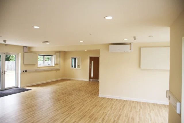
In the same way that a busy wallpaper would be too much, covering every square inch of display space in colour, text, and images creates a vast sea of ‘stuff’ and it’s hard to distinguish what’s important to understand. Keeping a percentage of the space blank helps to break it up and reduce the clutter.
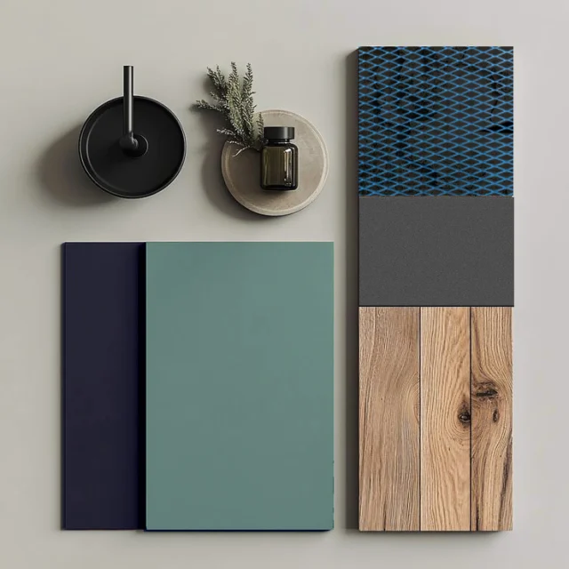
A mistake that schools often make is applying lots of bright colour to displays when, actually, a calmer and more limited palette achieves communication goals much more successfully (using a muted background colour allows the detail that you’re displaying to become the ‘hero’ rather than part of the overall noise). High contrast aids readability but that doesn’t mean it has to be black and white. We work with light reflective values (LRV) to pair colours that have the required contrast but don’t overload.
Clear and consistent signage reduces cognitive load and helps pupils navigate buildings more independently.
Displays should have a clear hierarchy so users can quickly identify the most important information. Too many competing messages reduce clarity.
Zoning key types of display together makes information clearer and more predictable. Functional information, learning resources, celebrations, and affirmations can be grouped and broken up with empty space.
Visual fatigue happens when displays stay the same and users become blind to them. Changing displays periodically creates visual interest and keeps information relevant and topical.
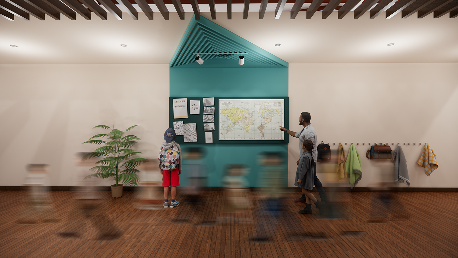
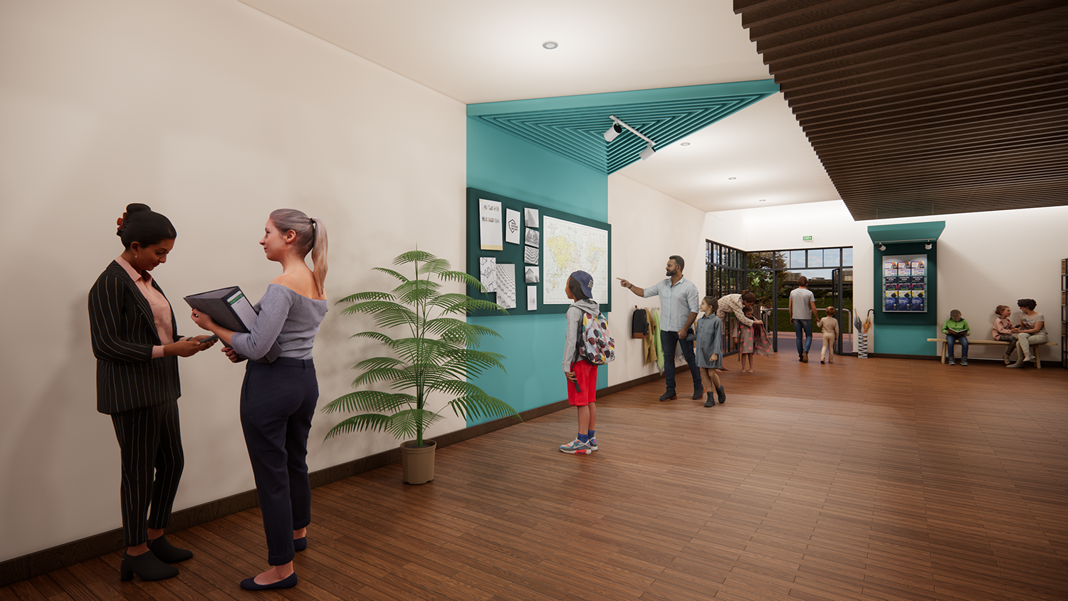
While the information displayed in schools will evolve over time, having a working guideline that outlines the overall approach to using wall space gives everyone in the setting something to work to and we can collaborate with schools to create that.
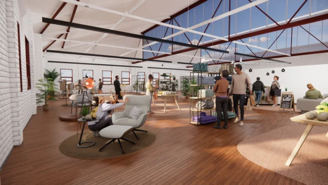
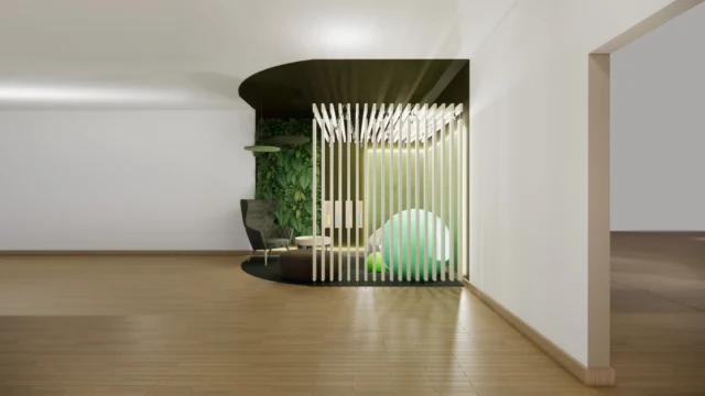
These principles can equally apply to workplaces and public spaces and provide relief from the constant bombardment of visual stimuli, which is often counter-productive. The following examples are from designs for a design studio space and a noticeboard in a veterinary practice waiting room.
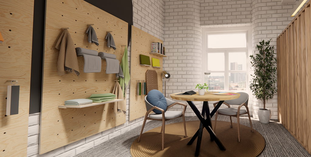
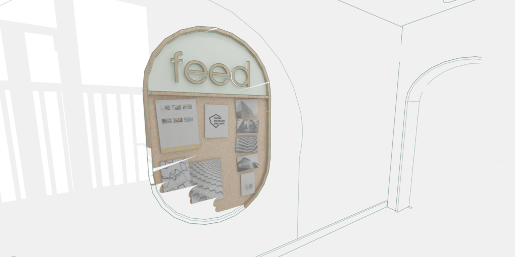
Farrar Bamforth works with schools to develop inclusive interior strategies, in line with guidance from experts such as National Autistic Society, Department of Education, and Design guidance: building bulletins that support learning, wellbeing and accessibility.
Contact us to discuss how we can help yours.
Let's Talk